Finding the right moment to monetize: Rethinking onboarding and platform strategy for an audio mastering app
A product UX audit and platform-specific strategy for an audio mastering app. Creating a clearer before/after listening moment on iOS and exploring a credit-based monetization path for Android users.
The challenge
The challenge wasn’t the capability of the app.
It was how quickly users could understand and experience it.
The app is an audio mastering app that helps users clean, balance, and enhance their sound.The product has real utility for creators who want polished audio without heavy manual editing.
BUT the first-time experience was mostly tutorial-led like explaining controls, taps, and features before users experienced the result.
For a product like this, users don’t need to understand every control first.
They need to hear one simple thing:
My audio actually sounds better.
That was the main gap. The onboarding increased cognitive load, created feature overload, and missed a clear aha moment before the paywall.
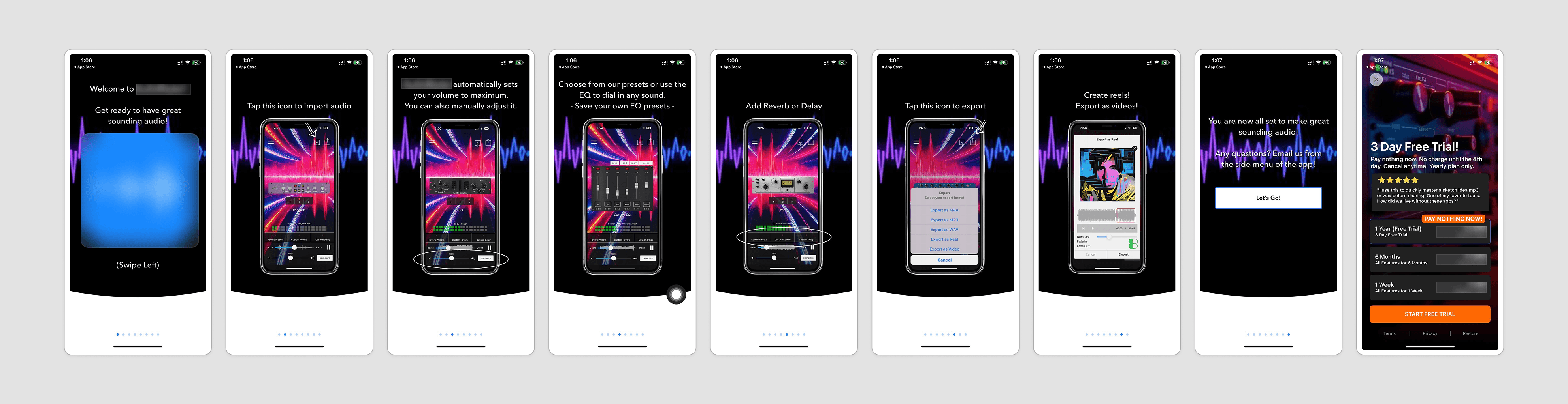
Current onboarding flow
The app collected useful preferences, but the value payoff appeared only after users were asked to sign up or start a trial.
Key Insights
The paywall was not hidden. Users were seeing it.
The issue was that not enough users were ready to act when they got there.
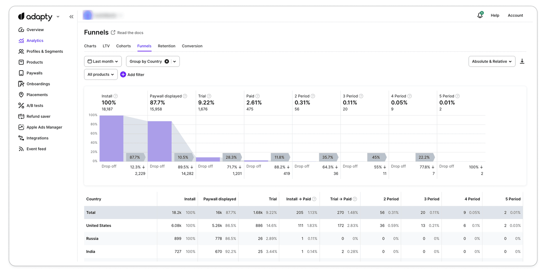
The audit data showed:
87.7% saw the paywall
9.22% started trial
2.61% converted to paid
So the question was not:
How do we show the paywall more?
It was:
Have users felt enough value before we ask them to pay?
That changed the direction of the recommendation.
Core diagnosis
The app was powerful, but it felt complex too early.
AudioMaster had useful pro-level controls - EQ, reverb, delay, sound styles, presets, export, and more.
But everything was introduced too early and too equally.
For a beginner or casual creator, that can feel overwhelming. They may not know what to adjust, what matters most, or whether the app has actually improved the audio.
The audit called this out clearly: the EQ panel was powerful, but showing it too early increased cognitive load. A better approach was to first give users a simple auto-mastering experience, then let advanced users go deeper with manual controls.
So the strategy became simple:
Don’t start with controls.
Start with the result.
Looking beyond onboarding
The audit also looked at what happens after users enter the product.
The product had strong features, but too much appeared too soon. For a new user, controls like styles, EQ, reverb, delay, presets, compare, and export needed a clearer starting point.
The main issue was not the features themselves. It was the order.
Users needed to first understand:
My audio sounds better.
Then they could explore deeper controls.
So the recommendation was simple:
Start simple → Let users hear the improvement → Reveal advanced tools when needed
This made the strategy stronger because it didn’t only improve the path to the paywall , it also made the product easier to understand after users got inside.

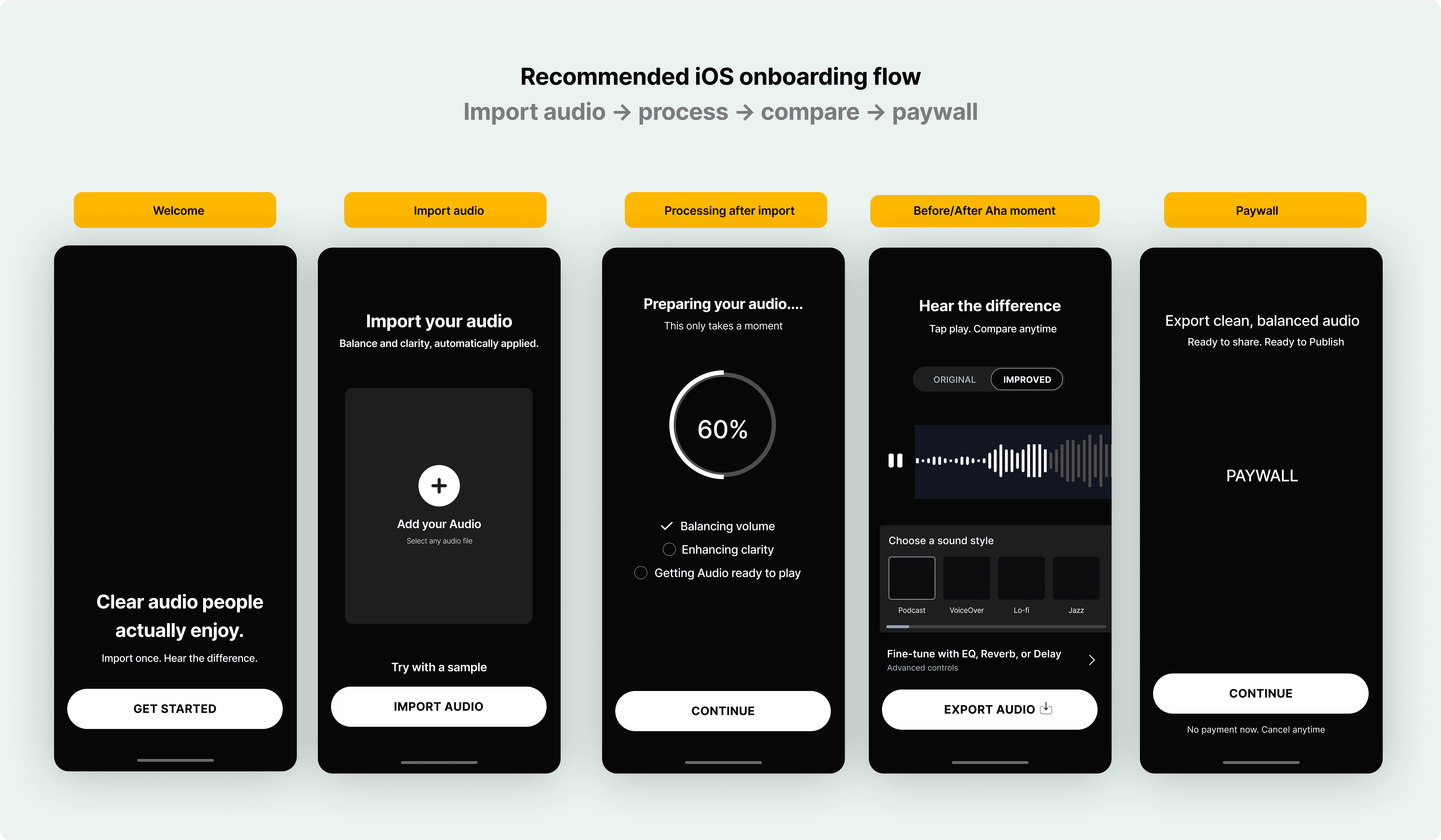
iOS strategy
Create the aha moment before the paywall
For iOS, the focus was mainly onboarding and paywall readiness.
Instead of taking users through multiple tutorial screens, the recommendation was to move them into action quickly:
Import your audio.
Let the app improve it.
Hear the before and after.
Then decide if you want to export or go deeper.
The proposed onboarding flow included a welcome screen, import audio, processing after import, and a before/after listening moment.
This made the experience more direct
Not:
Here’s everything the app can do.
But:
Try it once. Hear the difference.
Recommended iOS flow
Let users hear the improvement before the paywall
The new flow was designed to get users to the outcome faster.
Instead of teaching every feature upfront, the app first helps users import audio, auto-process it, and compare Original vs Improved.
That before/after moment becomes the product’s first “aha.”
Advanced tools like styles, EQ, reverb, and delay are still available — but only after users understand the core result.
This makes the paywall better timed because users are no longer paying for a promise. They’re unlocking something they’ve already heard.
Android strategy
iOS was about conversion.
Android needed a softer path to commitment.
For iOS, the focus was to get users to the aha moment faster and make the paywall feel better timed.
But Android needed a slightly different approach.
If users skipped the paywall, the experience couldn’t simply end there.
They still needed room to try the product, understand the improvement, and build enough trust to come back or upgrade later.
So the Android strategy shifted from a direct subscription push to a more gradual usage-based path:
Import → Process → Compare → Free export limit → Advanced lock → Paywall
This is where the credit system came in.
"2 free exports left"
gave users a reason to keep using the product without removing monetization. It let them experience the core value first, while export limits, premium styles, and advanced controls created more natural upgrade moments.
The goal was not to make Android “free.”
It was to let users try enough to understand why upgrading matters.
Homepage redesign
Make the first action obvious
A powerful product still needs a clear starting point.
The original homepage showed the app’s depth, but it didn’t guide users into the first action clearly enough.
Users were landing directly into controls, sliders, presets, and compare options before they had even imported audio. So even though the product looked powerful, the experience could feel unclear for a first-time user.
For AudioMaster, importing audio is the beginning of the entire value loop.
Without import, users can’t process audio.
Without processing, they can’t hear the improvement.
Without hearing the improvement, the paywall has less reason to work.
So the redesign made the first action obvious:
Import your audio.
From there, the experience moves in a cleaner sequence: import the file, process it, hear the enhanced version, then explore styles or advanced controls.
The goal was not to hide the product’s power.
It was to reveal it in the right order.
What changed strategically
The work moved AudioMaster from a feature-heavy experience to a more guided product journey.
Instead of asking users to understand the tool first, the new direction helped them experience the result first.
The product flow became clearer:
Import audio → Hear the improvement → Explore styles → Go deeper if needed → Export / upgrade
This was the main shift.
The app didn’t need to hide its advanced capabilities. It just needed to introduce them at the right time.
Expected impact
The recommendations were designed to improve the first-time experience without removing the depth of the product.
The focus was to help users:
understand what to do first
hear the product’s improvement sooner
feel less overwhelmed by advanced controls
reach the paywall with more context
discover premium features through natural actions like export, styles, and fine-tuning
For iOS, the goal was stronger trial readiness.
For Android, the goal was a softer path to conversion — giving users enough room to try the product before asking them to upgrade.
Confidentiality note
This case study is based on work completed as part of a contract engagement. Client branding, sensitive visuals, and analytics details have been anonymized or recreated where needed.